A 22 million-page project
One application, many possibilities
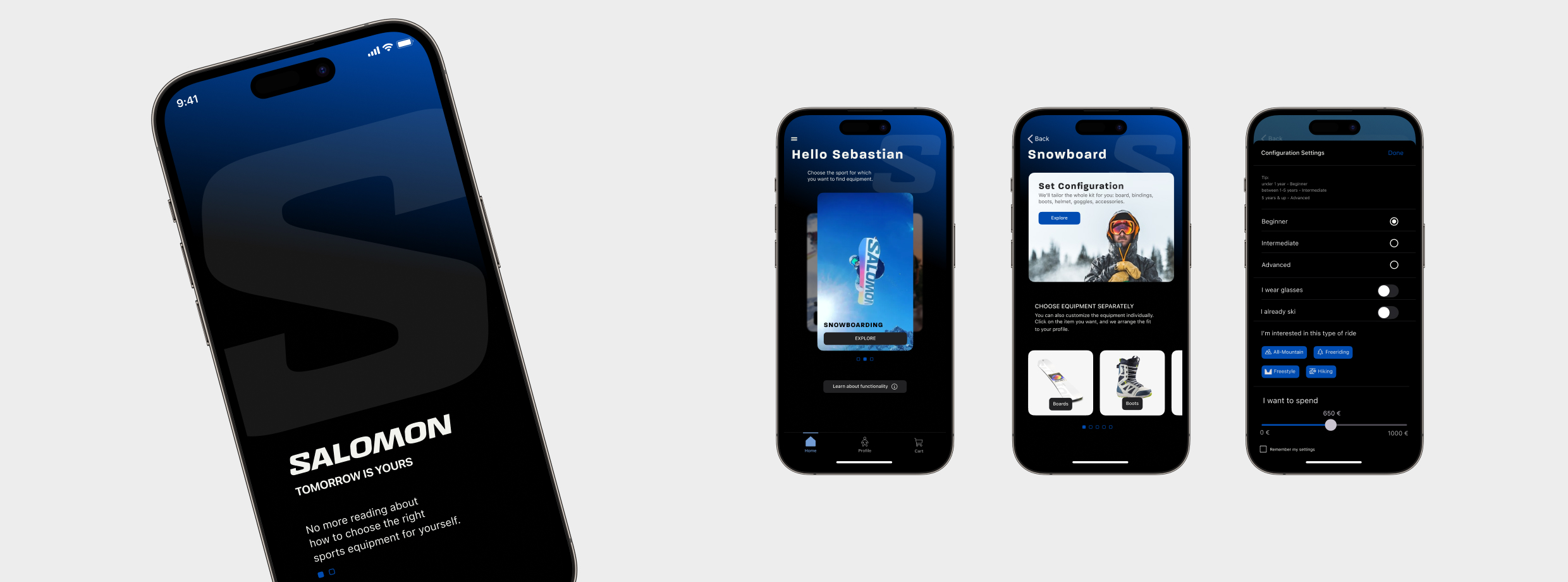
Project overview
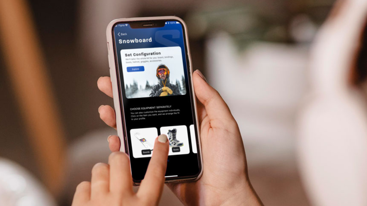
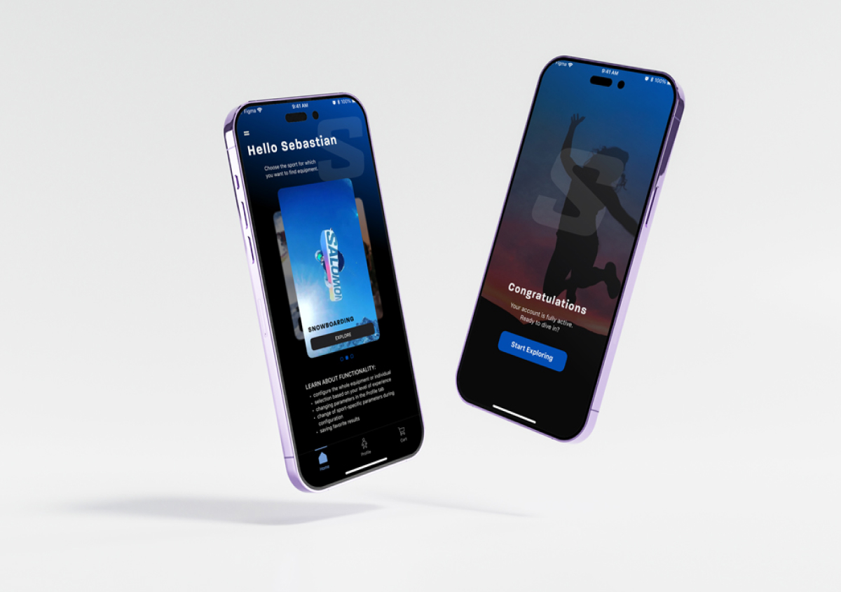
Using a mobile application to replace advice on choosing sports equipment scattered on the website by creating a tool for professional selection of sports equipment based on individual user data.
Role
UI/UX designer
Time
4 weeks
Platform
Android, iOS
Goals
Design a tool that not only simplifies equipment selection for users across multiple sports but also provides a scalable framework to accommodate additional sports in the future.
For business, creating an additional channel for non-intrusive product sales.
Challenges
Usability: Usability: Ensuring the tool is user-friendly and intuitive, so customers can easily navigate and select the right equipment without confusion.
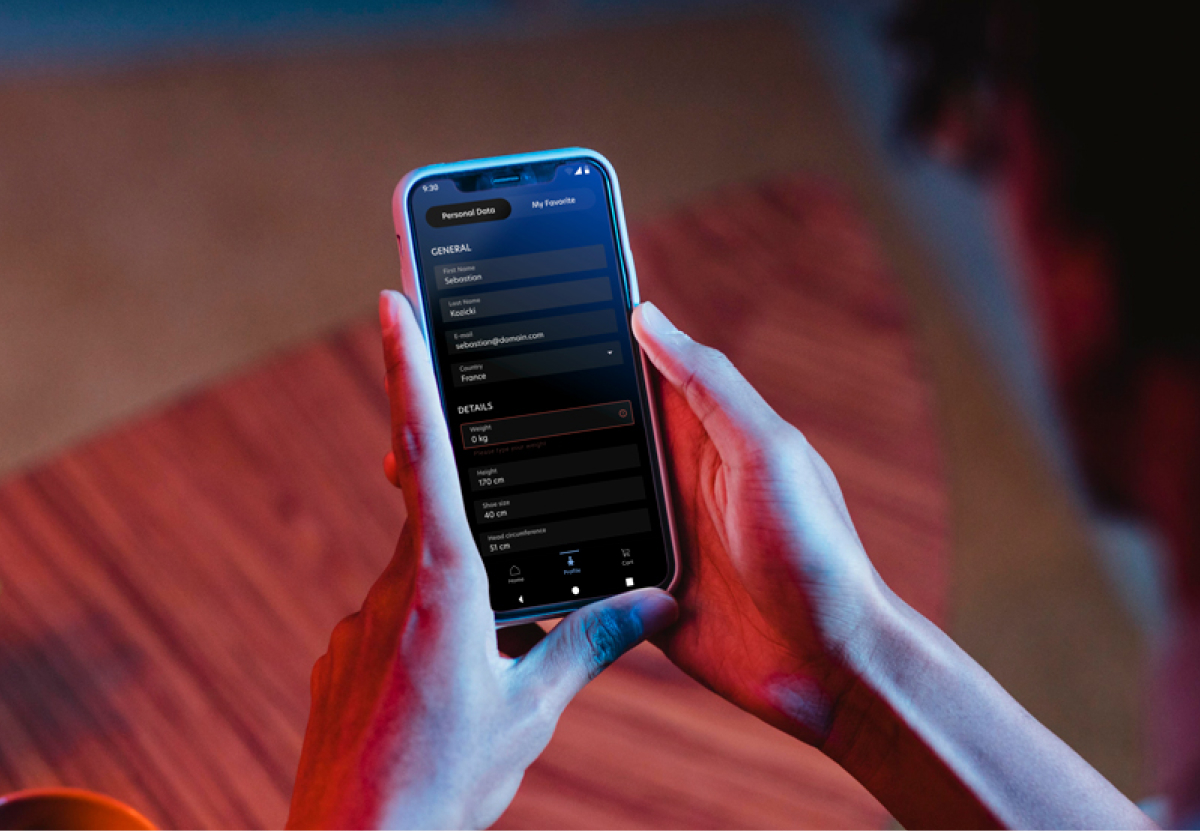
Accuracy: Providing accurate and user-tailored equipment recommendations based on user preferences and sport-specific requirements.
Deliverables
UI style guide & clickable prototype
Testing
Usability testing with users was conducted remotely on a high-fidelity prototype. Only a sample of the screen is presented for each test.
Participants
2 on Android, 2 on iOS
Given tasks
Log in / Sign Up and check your profile data, carry out the equipment configuration
Testing method
remote testing with screen sharing, testing face to face
Android testing version with comments [left]
Screen after first iteration [right]
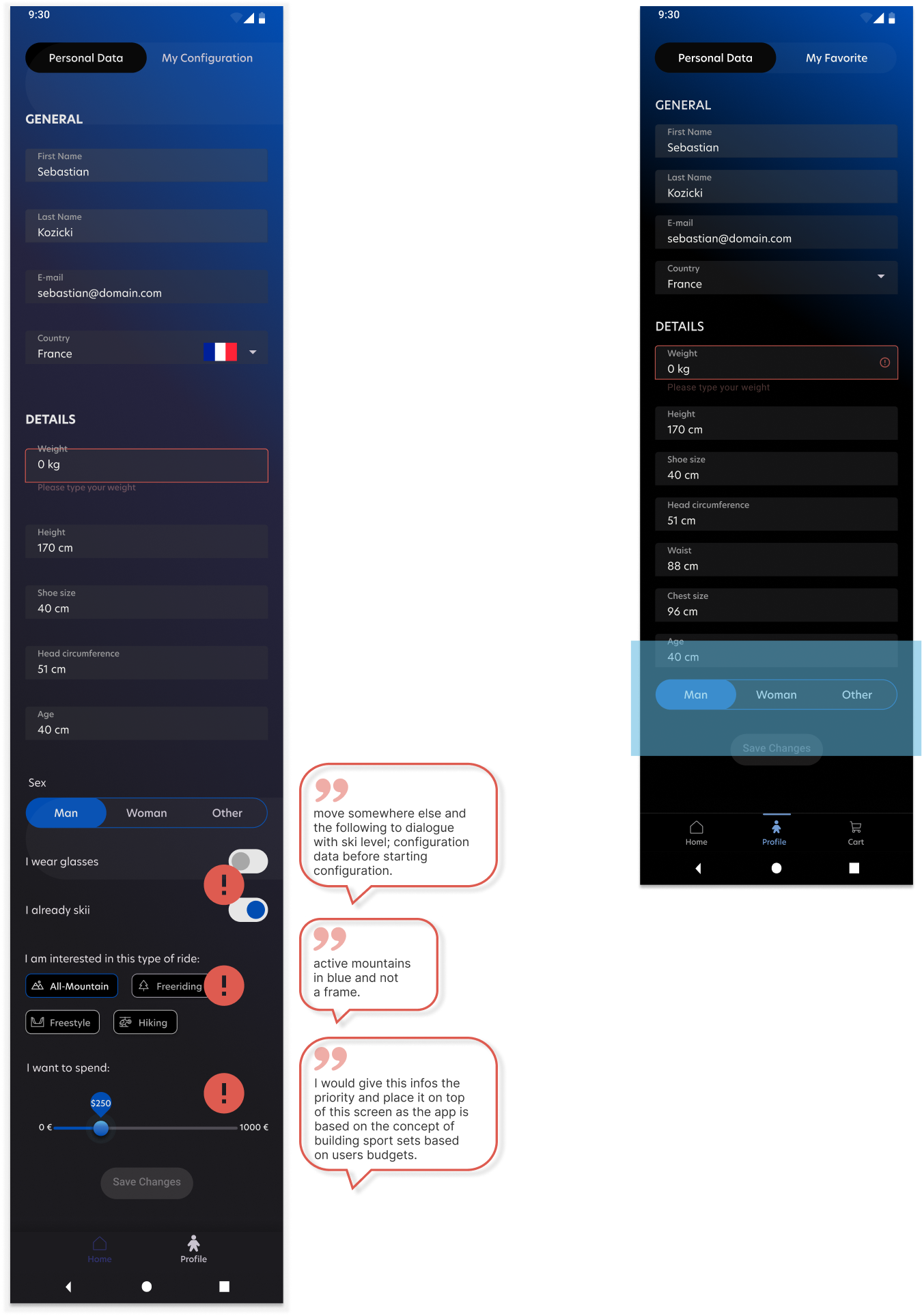
What has been corrected (after Android test)
profile has been shortened - non-physiognomy details have been moved to flow configuration (reducing cognitive overload)
the readability of icons in the lower nav bar has been improved
graphic indication of the country turned out to be an unnecessary feature - the flag was deleted
Comments not implemented:
moving the budget slider on top of the configuration screen
- final tests showed that the user can increase his budget if it is at the end rather than at the beginning of the configuration
iOS testing version with comments [left]
Screen after first iteration [right]
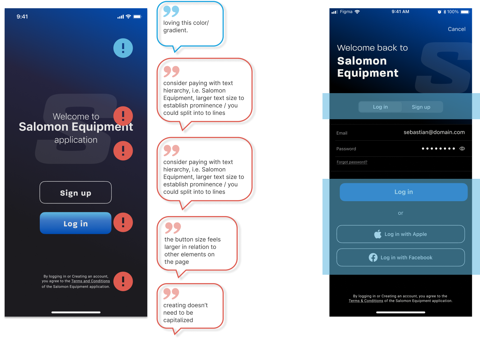
What has been corrected (after iOS test)
adding additional screens with information about the application (onboarding)
resizing the buttons (accessibility)
switching between Log In / Sign Up screens
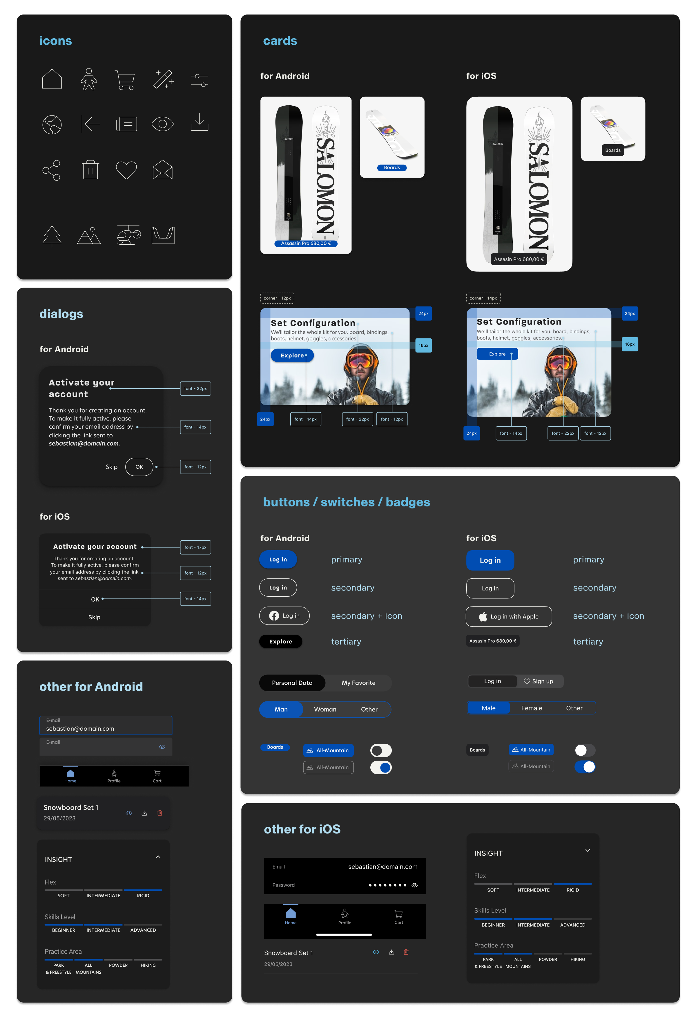
UI goodies
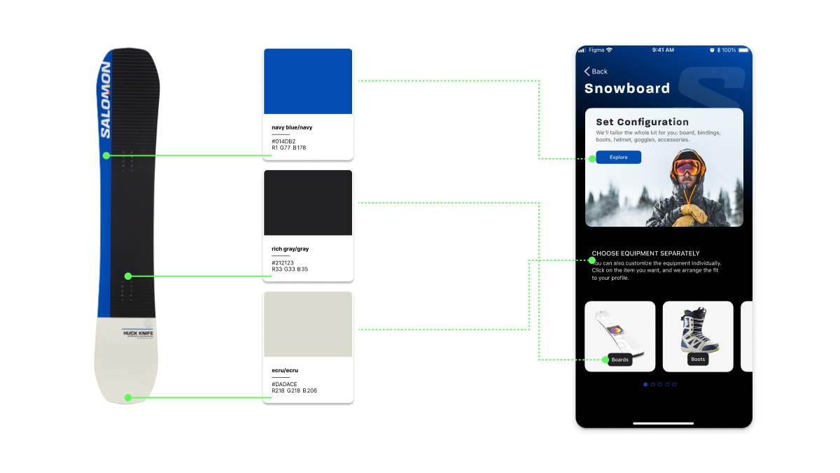
Because this is not an official application, I had to find a way to deal with colors and typography independently. Salomon will not provide any branding materials on their website, so I used one of their products - the Blue Fire series, from which I selected three colors and adapted the typography as much as possible based on a sample headline font on their website: Salomon Sans. Font for the body: New Hero. Also, I used Android and iOS documentation to be compliant with the native systems.
Color Pallete
Typography
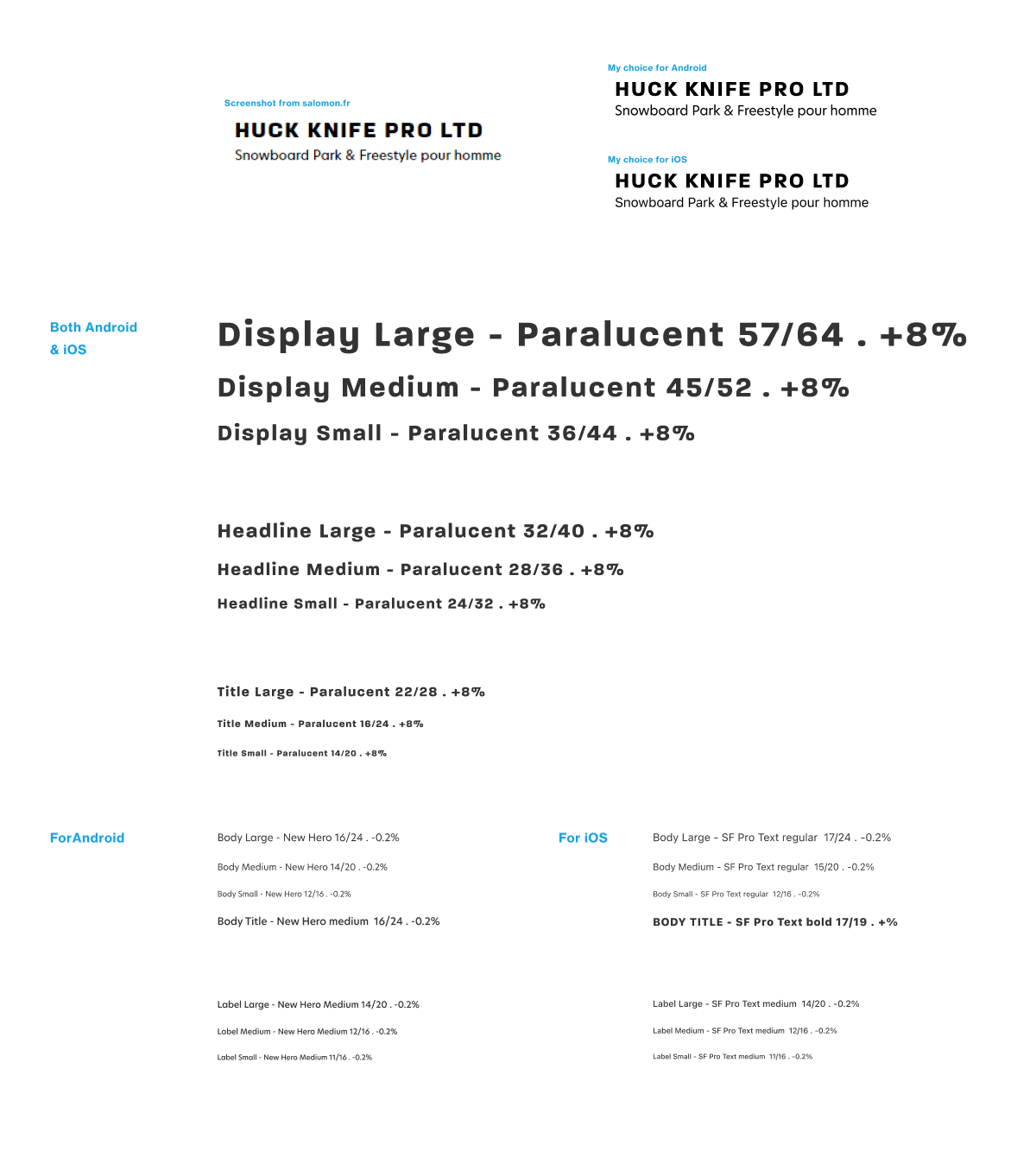
Components
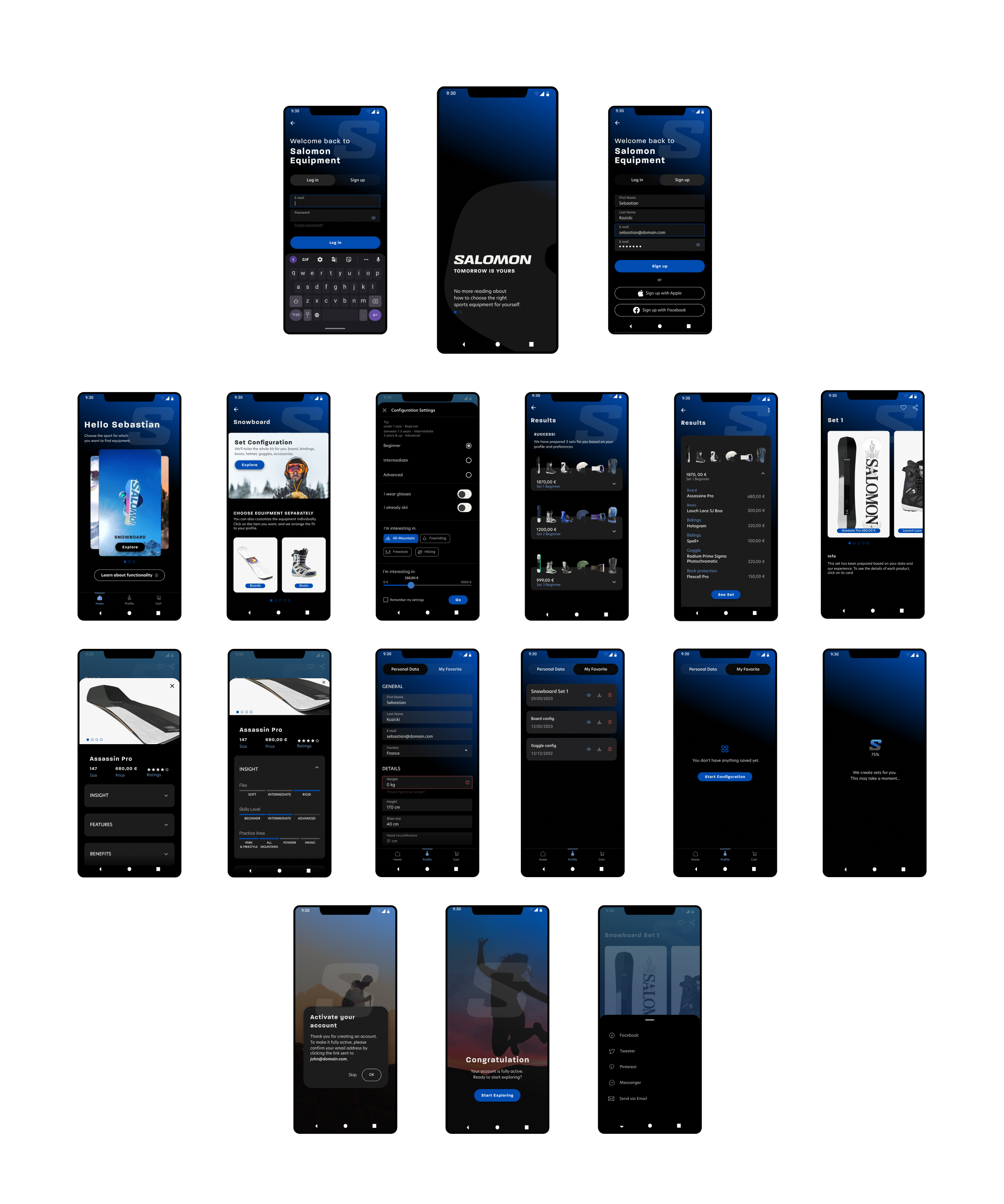
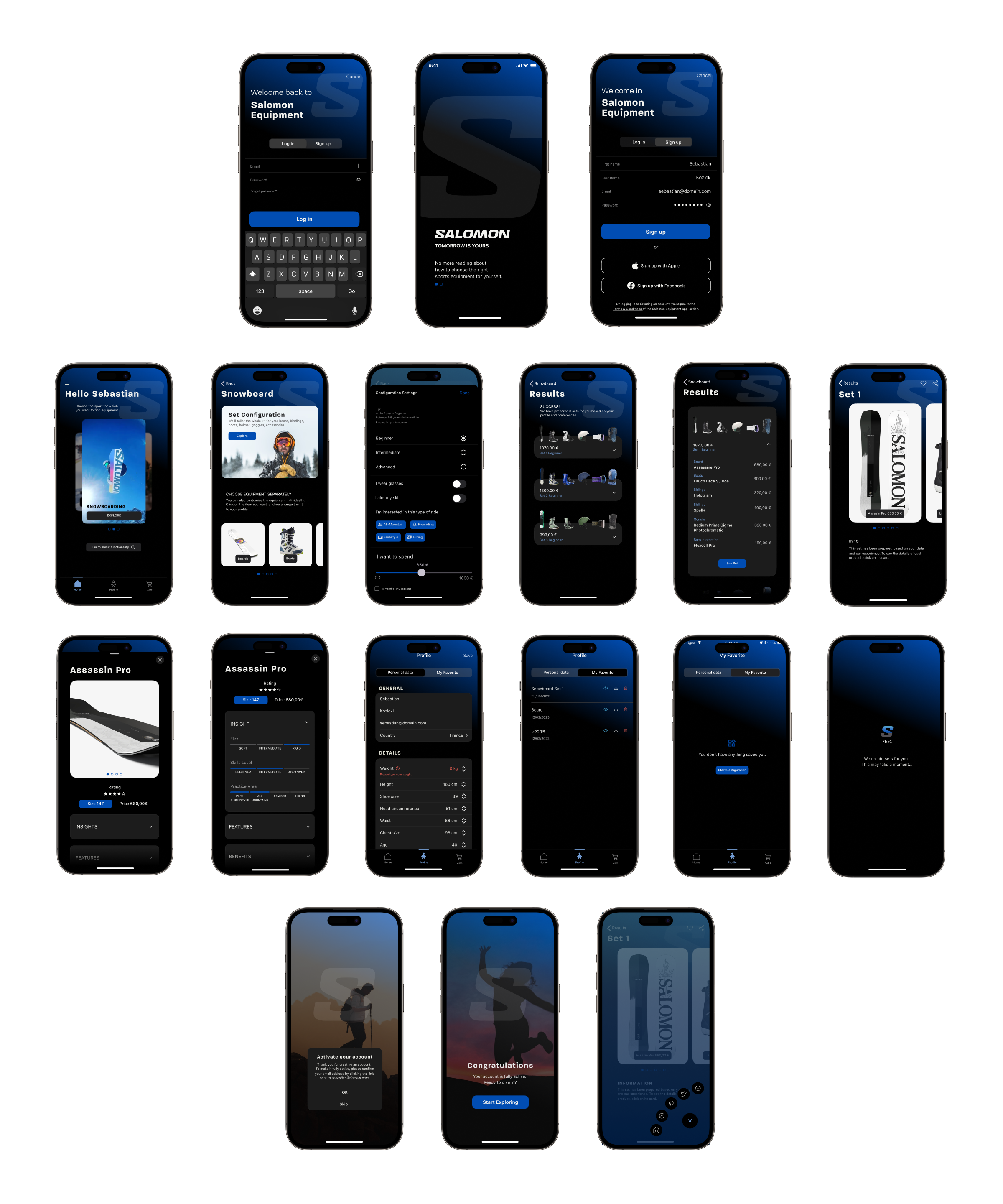
High fidelity mockup
17 screens for iOS
17 screens for Android
Android
iOS
Takeways
Dark mode is the new standard
Designing native apps is quite challenging, especially in dark mode which became one of the mainstream trends in 2022 and 2023. To cope with it properly good documentation is a key to knowing what are "dos" and "don'ts," what is a good practice, and what you shouldn't do. Material Design 3 by Google is prepared in great detail and is user friendly. Human Interface Guidelines by Apple are more conceptual, leaving many design aspects loose and open.
See full case study >>Did I achieve the Goal and cope with the Challenges?
The goal was to create a tool that simplifies equipment selection for users across multiple sports and provides a scalable framework for accommodating additional sports in the future. The answer is YES:
- usability tests showed that the application architecture is simple and intuitive (most of the comments from the tests concerned aesthetics),
- creating a "node" screen and taking a modular approach (every single sport is a separate branch) will ensure that the application can be quickly extended in features, allowing addition of sports categories without interfering with those already implemented.
What were the challenges:
Usability: Ensuring the tool is user-friendly and intuitive so customers can easily navigate and select the right equipment without confusion:
- I based my application on well-known patterns and components used by big companies like Airbnb, Decathlon, etc., so the user will feel like they already know how to navigate in my application,
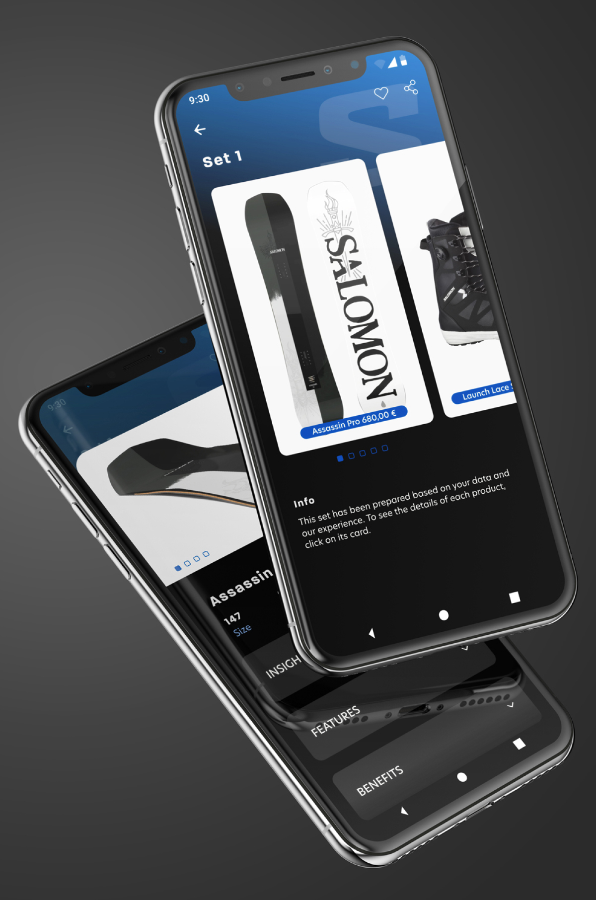
- I simplified flows as much as possible by deleting unnecessary steps like setting up your profile every time you configure your equipment set or by showing details of the item only for the recommended ones. Hence, the users had complete information immediately.
Accuracy: Providing accurate and user-tailored equipment recommendations based on user preferences and sport-specific requirements:
- this will be ensured by the accurate and detailed user profile containing the required technical specifications of the equipment,
- the application based on the technical data with a personal approach to each user will be a better solution than reading 22 million pages about how to choose sports equipment - it's a time-saver.