Fresh look, new adventure
ViaEurasia application redesign
Project overview
Redesign of the existing ViaEurasia application implemented as part of the UI course. The aim was to consider feedback from real users and the creative director of Culture Routes Society and design a new layout for some screens.
Role
UI designer
Duration
2 days
User feedback
Navigation within the app is confusing.
There are more screens than necessary.
The branding and color feel dated and unsophisticated, and they don’t follow accessibility guidelines.
Goal
Make changes following user feedback and guidelines from the creative director.
Creative director notes
The app’s “Home” page looks like a legal document and is uninviting. Experiment by moving the sponsor logos and information to the “About” page. The layout of the “About” page should then be reorganized to make it more visually appealing.
Once all the legal text and sponsor logos have been removed from the “Home” page, design a new logo and create an impactful “Welcome” page (to replace “Home”).
Remove the “Check Before You Go” page and replace it with a new menu that includes the same 3 button topics (Route Updates, Weather, Guide Book).
Via Eurasia’s brand typeface is Inter, which you shouldn’t change. You can, however, adjust the size and weight of the text on each page to create a better hierarchy and improve accessibility.
Not every Frame needs a complete redesign, but they should all be improved from an accessibility standpoint. You might choose to keep the same layout for “Routes,” “Route Detail,” or “Points of Interest” and just update the brand colors to comply with accessibility best practices, for instance.
Rebuilding screen by screen
Below I present 6 screens that I redesigned along with descriptions of what was changed and why.
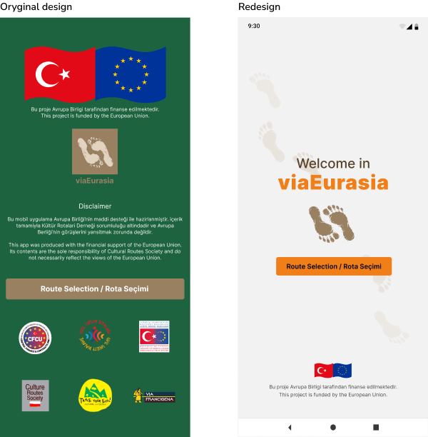
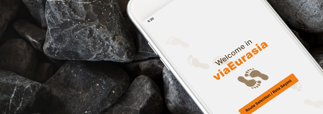
Modifications HOME SCREEN:
change the background color to light
correcting the logo
adding a greeting
removal of disclaimer and sponsors' logos (moved to About us page)
changed the location of EU flags and information
changed the color and size of the button.
Design decisions
Readability: A light background better exposes the logo, name of the app and
greeting.
Aesthetics:I chose orange (a color of energy and activity) for the buttons and other
elements to be emphasized.
With a uniform ground and a color scheme in the range of white and light gray, it will be very easy to
introduce a possible dark mode,
which is trendy and valuable at present (2023). Plus, it's giving the app a modern minimalist look.
The overall look of the app was modeled on the new version of Airbnb, which is getting rave reviews from
designers.
Bonus:The size of the EU logos was verified with the EU requirements for project
marking.
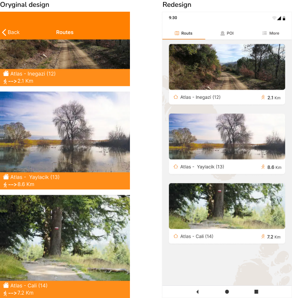
Modifications ROUTS SCREEN:
change of top navigation
roads as cards
introduced background color + subtle graphics
Design decisions
Easy navigation: I decided to use only the top navigation as a tab to minimize
the number of navigation elements that could confuse the user with such a simple design.
Usability: I introduced the acronym "POI" (point of interest),
commonly used in applications with routing capabilities or a database of default routes.
Also, I have dropped the arrow suggesting the length of the route due to the lack of common use
of this element in other travel apps.
Design: The entire app has a solid background with slight graphics
from the logo - a subtle way of branding the app; thanks to the divergent darker background, the white
card maintain the principle “the light comes from above.”
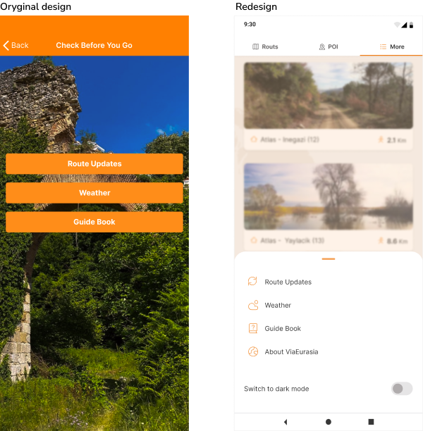
Modifications MORE SCREEN:
using the 3 tab as a collecting element for items that are not roads and POIs
creation of a pull-out drawer at the bottom of the screen for 3 buttons and other settings
Design decisions
Easy navigation: To avoid adding a burger/kebab menu, I created a third item in the top
navigation:
MORE, as a drawer. Clicking on each item will take you to a particular screen from which,
via the "back arrow," the user will return to the ROUTS screen. I also added an overlay to
highlight the contents of the drawer better.
Readability: I also added an overlay to
highlight the contents of the drawer better.
Design: The icons are supportive and enhance the aesthetic experience.
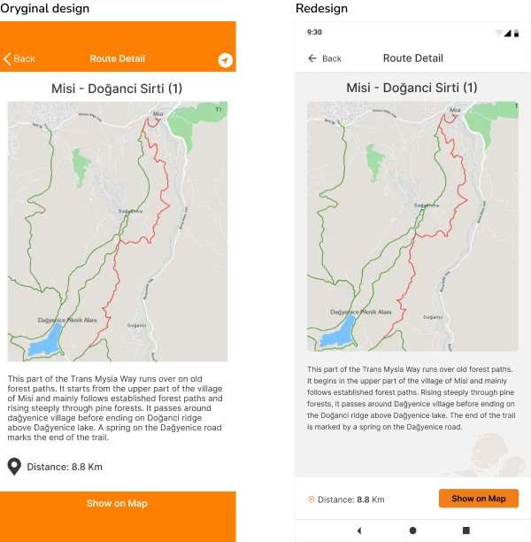
Modifications ROUTE DETAIL SCREEN:
adjusting the color scheme to the new layout
improving text readability
rescaling the map to fit in with other elements
adding a button for the map view - previously the map had no interactivity
Design decisions
Usability: Isolating the button along with the distance information
is a proven way to increase the chances of the user using this functionality.
Readability: Increasing the interline in the body copy provides better readability.
Design: Introducing margins for the map image is a consistency across the app
behavior, just like introducing a white background for the top navigation.
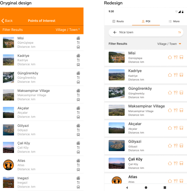
Modifications POI SCREEN:
added a search bar
chang the regular list to a list built from tabs
unified icons and changed their size
Design decisions
Usability: I didn't understand where the filtering results came from,
so I permanently made the search bar with the filtering option (icon on the right) on this screen.
Leaving the bar on the search results page will allow the user to change their search preferences more
easily - he will not have to go to this screen to adjust search parameters.
Readability:
Enlarging icons to emphasize the convenience of a given location.
Design: Introducing cards with basic-level elevation is a behavior-consistent
layout with a more attractive appearance than the usual list. In addition,
I have changed the typography hierarchy to emphasize the names of the searched places, but perhaps the
distance issue should be more critical. Icons were given an orange to make the eye naturally wander in
their direction.
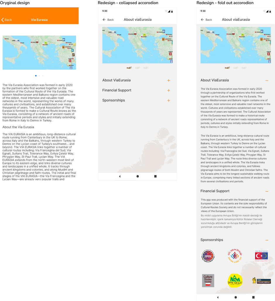
Modifications ABOUT SCREEN:
rescaling the map
adjustment to the new layout
adding foot icons as new pagination
dividing the content into 3 parts - the option of expanding and collapsing the section
Design decisions
Usability: Dividing content into drop-down sections gives the user power over what is
displayed at any given time, so he can choose what he wants to read first and not scroll endlessly
through the screen
Readability: Increasing text readability by increasing line hight.
Design: Introducing foot pagination is another way of branding the product and
introducing a bit of "fun". As suggested, the sponsors' logos and the disclaimer from HOME have been
placed here as separate sections.
Let's see if I achieve the goal
User feedback
A. Navigation within the app is confusing.
B. There are more screens than necessary.
C. The branding and color feel dated and unsophisticated, and they don’t follow accessibility guidelines.
How I used user feedback
A: Introduction more intuitive navigation.
A, B: Introduction of MORE tab and drawer.
C: Change the color scheme and use one color as an accent;
Improving readability by adjusting colors with an appropriate contrast ratio, improving
typography and line hight.

Creative director notes
A. The app’s “Home” page looks like a legal document and is uninviting. Experiment by moving the sponsor logos and information to the “About” page. The layout of the “About” page should then be reorganized to make it more visually appealing.
B. Once all the legal text and sponsor logos have been removed from the “Home” page, design a new logo and create an impactful “Welcome” page (to replace “Home”).
C. Remove the “Check Before You Go” page and replace it with a new menu that includes the same 3 button topics (Route Updates, Weather, Guide Book).
D. Via Eurasia’s brand typeface is Inter, which you shouldn’t change. You can, however, adjust the size and weight of the text on each page to create a better hierarchy and improve accessibility.
E. Not every Frame needs a complete redesign, but they should all be improved from an accessibility standpoint. You might choose to keep the same layout for “Routes,” “Route Detail,” or “Points of Interest” and just update the brand colors to comply with accessibility best practices, for instance.
How I ensured compliance with creative director directives
A: Moved the suggested elements, improving the logo, changed the color
scheme;
Use accordion for About screen to reduce scrolling and give a lighter look.
B: Creating a Welcome screen.
C: Adding the drawer.
D: Create a style sheet for typography and apply it consistently throughout
the application.
Unification of the entire application according to the established typography color scale
and new navigation.
E: To maintain consistency in the project, other screens have also been
redesigned.
Aspects that were a challenge in this project:
Searching for solutions for specific needs - on the one hand, it is sometimes difficult to limit yourself to only the guidelines. Still, on the other hand, the limitations allow you to achieve your goals in a given time.
Simple and logical structure - sometimes the simple solutions are the hardest to find.
The irresistible desire to add more functionalities - this is entirely unjustified in the business world because it generates additional costs and wastes time.