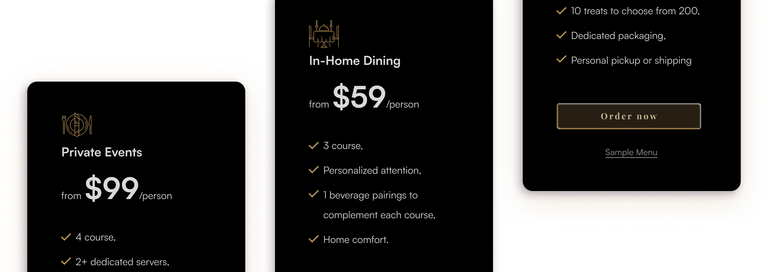
Choose a service that meets your needs
Exclusive dining services order via website
Starting from the very beginning
The project was prepared in cooperation with the developer for the private chef. The company name has been changed for this project.
For this project, we didn't have any materials: no logo, no brand guidelines, and no first reviews of the services.
Based on the questionnaire completed by the client, I built a brief that served as a base.
Project objectives
"Will provide users with general information about the company's purpose and the chef. Will inform users of available services. An event calander w/options to pre-book events. Client intake form. Chef portfolio & reviews. Introductory video (not yet made). Application Portal for inquiries to work with/for The Golden Knifes (servers, hosts, photographers, cooks, prep, etc). I'd like to add some form of "secret" button kind of hidden in plain sight. The button will take users to another page for premium exclusive clientele that offers late night/discreet service after midnight for single parties up to 4."
Business goals
Increase leads; build clientele; collect customer data; build exposure
Tone of communication
Direct but not aggressive; subtle, but not shy; luxurious & exclusive; less is more
Style
sexy, luxury, simple & elegant. Brand principles: Luxury & Exclusivity
Budget
$1000 (design & development)
Proposal
Considering the budget and requirements to start building digital appearance we proposed:
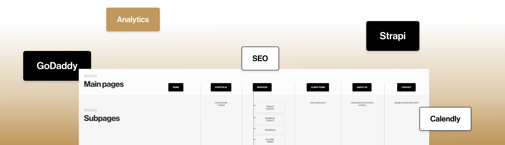
design 5 pages + Vip Section
(why 5 is explained at the end of the story)
CMS implementation - Strapi
implementation of a tool for analyzing website traffic and activity - Google Analytics
two selected ready-to-go plugins - e.g. Calendly
copywriting - apart from "about us" - here we suggest only changes
What we suggested to drop off for this moment and why:
I suggested introducing other functionalities such as Event Calendar / Subscription capabilities / Waitlist (subscriptions & tickets) at a later time to fit into the current budget and because the client had not been prepared for that yet.
Together we rejected the concept of a section in the CMS for subcontractors because it would generate unnecessary costs at this stage. We can add this using Strapi functionalities in the future.
The above functions are not needed to start a business and may generate high costs for someone who is new on the market.
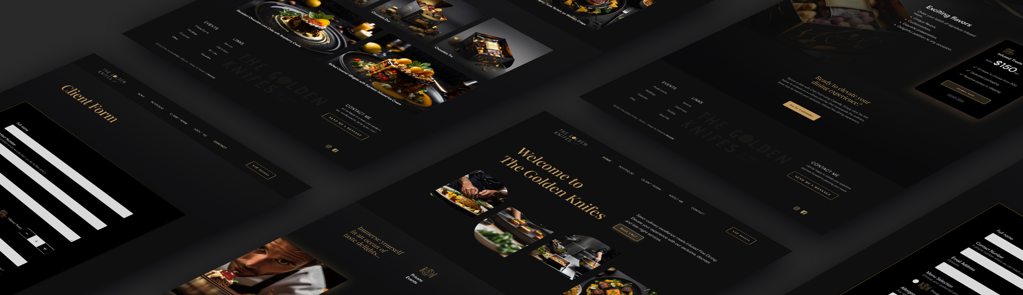
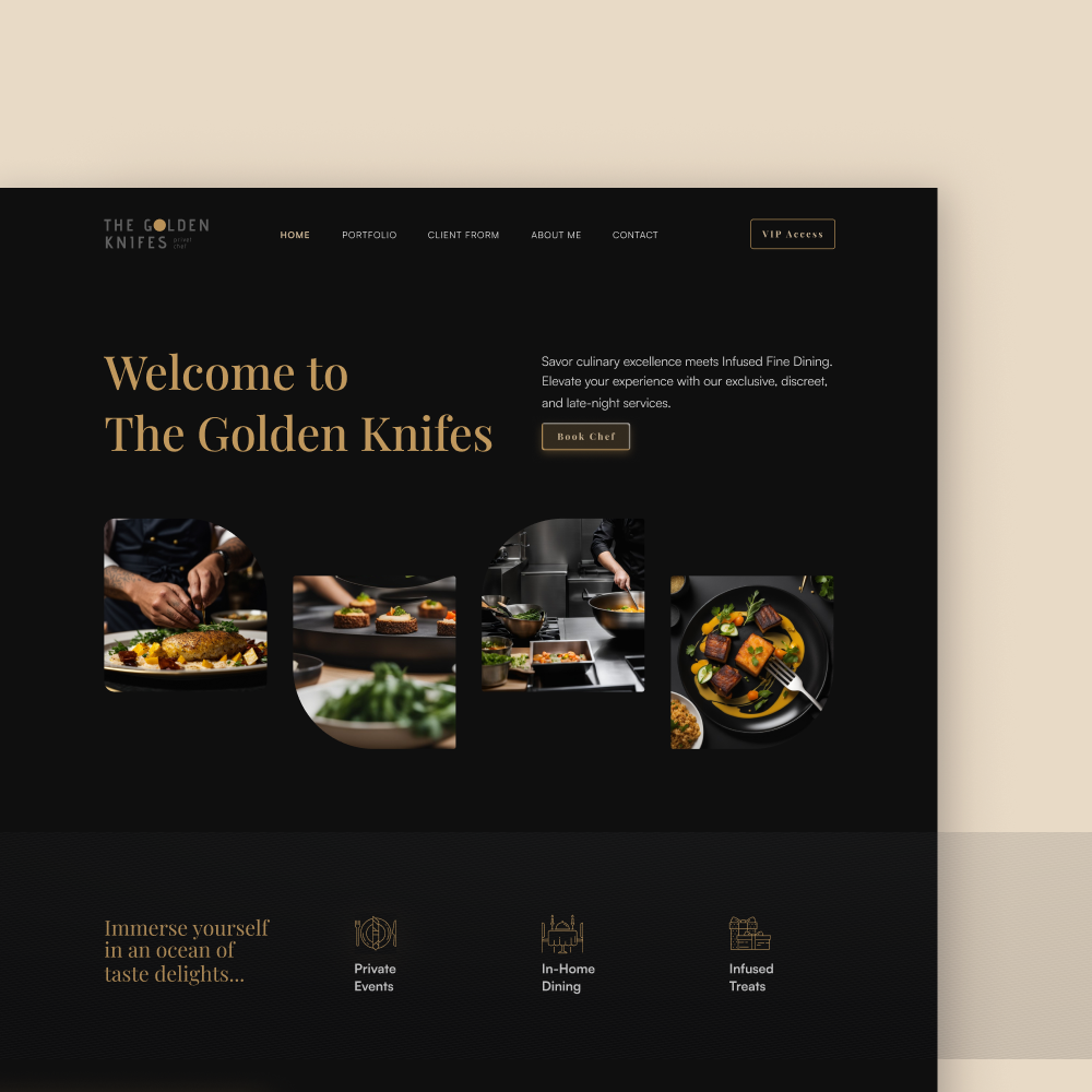
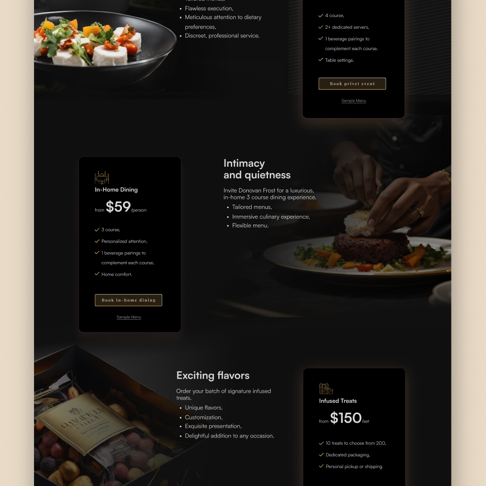
Welcome home dining
If you want to reach potential customers with a service that is not yet very popular, the home page must explain the service, scope, examples, testimonials and an invitation to action. All this was included in the project.
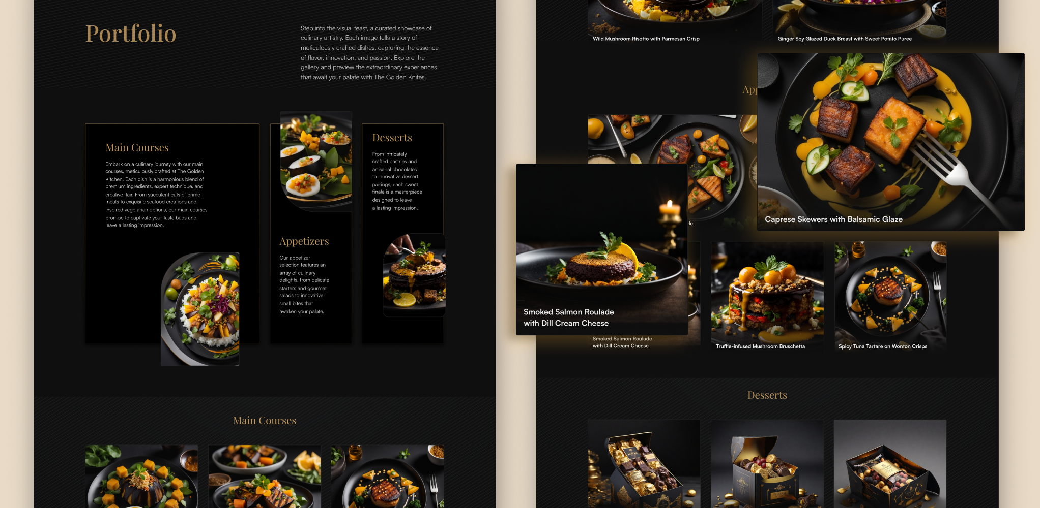
Taste the portfolio
We eat with our eyes, so the portfolio section must have a minimum of text and a maximum of images. The division into types of dishes will make it easier to experience the entire meal that is offered.
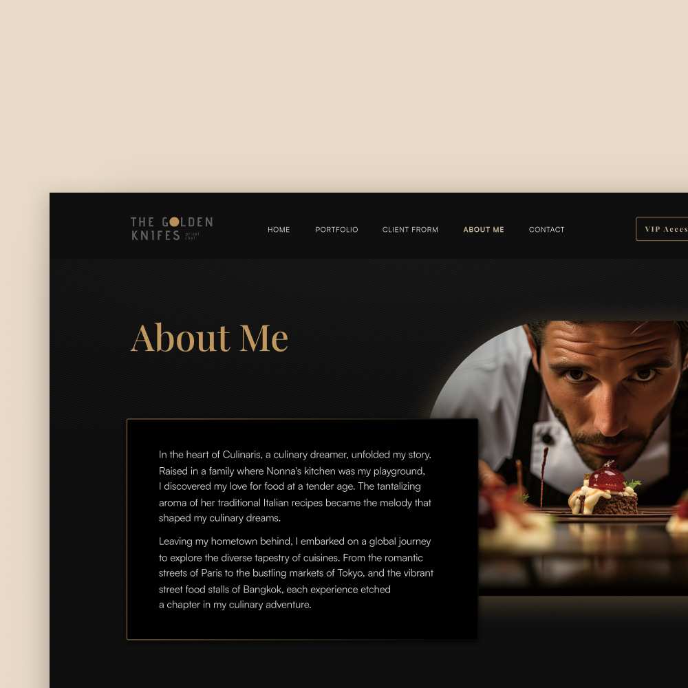
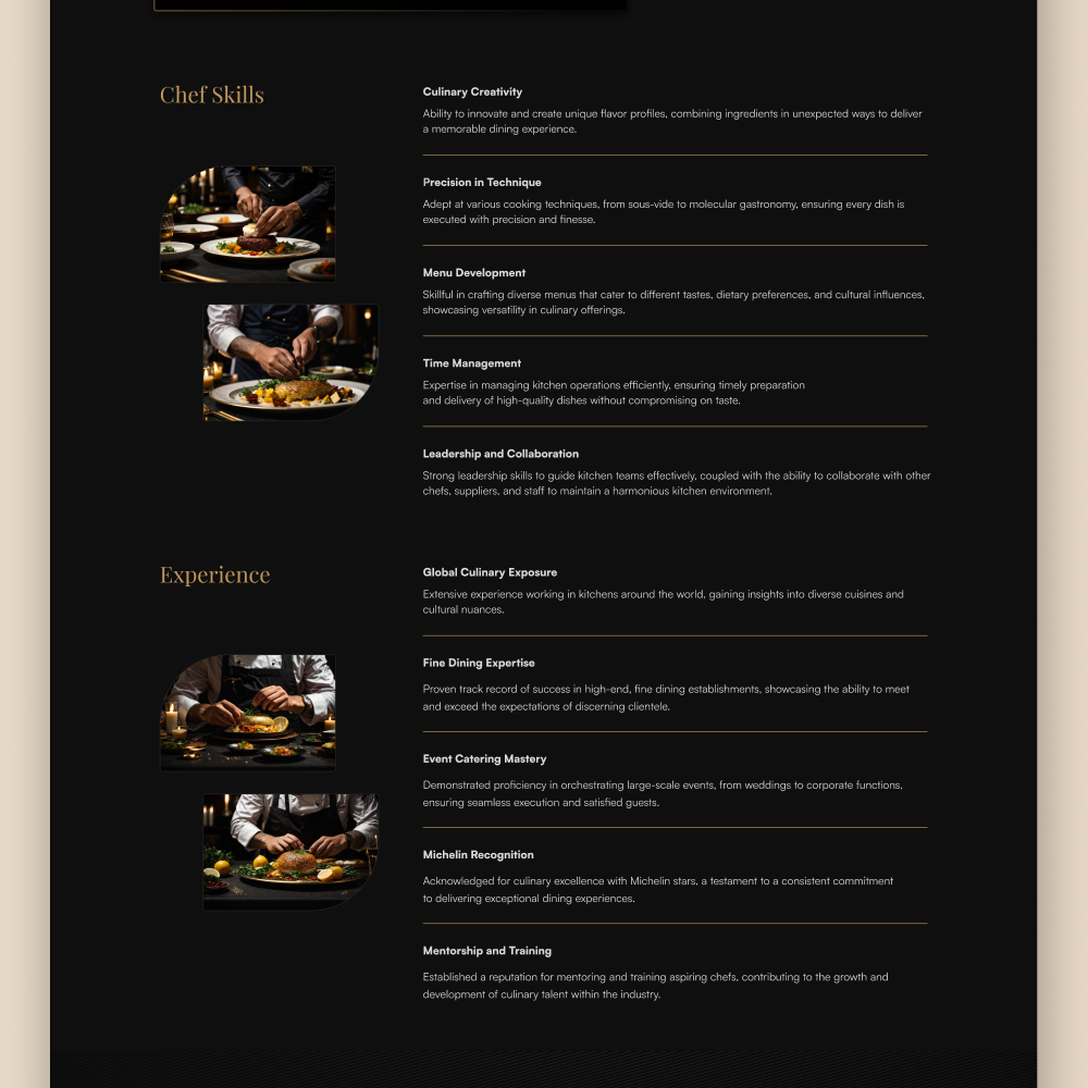
The power of talking about values and skills
The "About me" section is always problematic. I decided to divide it into two parts: the first is a short bio, and the second is a preview of what you can expect when hiring this particular chef. Promise and potential presented in a list that's easy to scan.
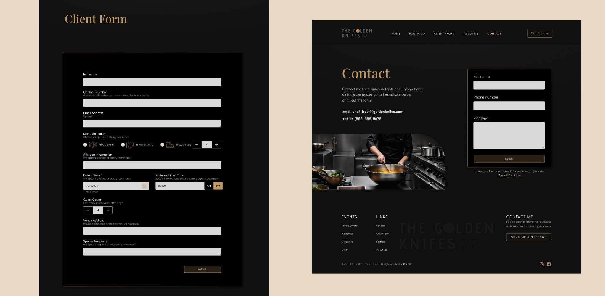
Connections are key
A simple and short form guarantees that a potential customer will not hesitate to contact us. Considering that some people do not like forms, traditional contact details are also included on the website.
And finally,
let's add some movement
Small interactions and animations add dynamism and bring websites to life. A private chef's website doesn't have to sparkle with fireworks, so I chose quite simple element animations.
NOTE: Sometimes, using Figma is not a perfect solution for prototyping. Since they introduced new features in 2023, I have observed a performance drop for prototyping options.
I'm perfectly aware of the shortcomings of this presentation. Next time Protopie or Webflow :)
Takeways
The project wasn't deployed because of client private issues. Nevertheless, working with real briefs and clients shows that are always some constraints that we need to address and deal with. No matter if it is a budget, timelines, or just client taste and problems. Thanks to this project, I improved my questionnaire for web design to make it more approachable and easy to understand. I cut off all technical questions and questions about future and possible plans. As a designer, I need to consider those things ( together with the developer) so clients can offer flexible, tailored services and grow their businesses.
Design decision
We decided to remove the Services tab due to the lack of a full offer - the development of this topic depends on the client's development direction.
The basic requirement was to achieve luxury and elegance, so I used black and gold for this project. For a more elegant look,
I introduce a traditional serif font for headlines and a sans serif font for the body.
Knowing that the website will be built in Strapi from reusable components,
I try to make the UI as simple as possible to not waste time re-coding those elements too much by the developer.
Usability
The form was cut off from elements that could be troubling for the clients - like age, social status, etc.
I include only the necessary information that allows the company to prepare the offers.
Looking at the sample menu from the home page as a model pop-up is a good approach for building engagement step-by-step.
We don't demand total immersion to give the users a small taste of what they can experience.
Accessibility
All the UI components, as well as backgrounds and body text, were tested for AAA standard contrast ratio accessibility.