A treasury of innovation
Reporting ideas and problems in modern companies is not easy. This application will make it easier—reporting, sorting, and processing—everything is in one place.
Don't think - design
I jumped into the project when it was already in Bubble. It was a 30-minute presentation with no print screens and only handwritten notes. The task was simple: make a redesign to make it "look attractive somehow."
The application has not been released yet (June 2024), so some details have been changed for this presentation.
Application is the property of the Polish software house Localhost Group therefore it is in Polish language.
Platforms
Browser
Duration
20h
Goal
Making the interface more up-to-date and attractive-looking.
Challenges
- lack of tests (usability, A/B) with users on the basis of which you can choose the direction for corrections (both for design and flow)
- no brand guide
- recreating the application layout from your head
Solution
Application flow analysis for better design of attractions and active elements
(it was necessary because the original flow didn't make sense at all)
Suggested: user testing
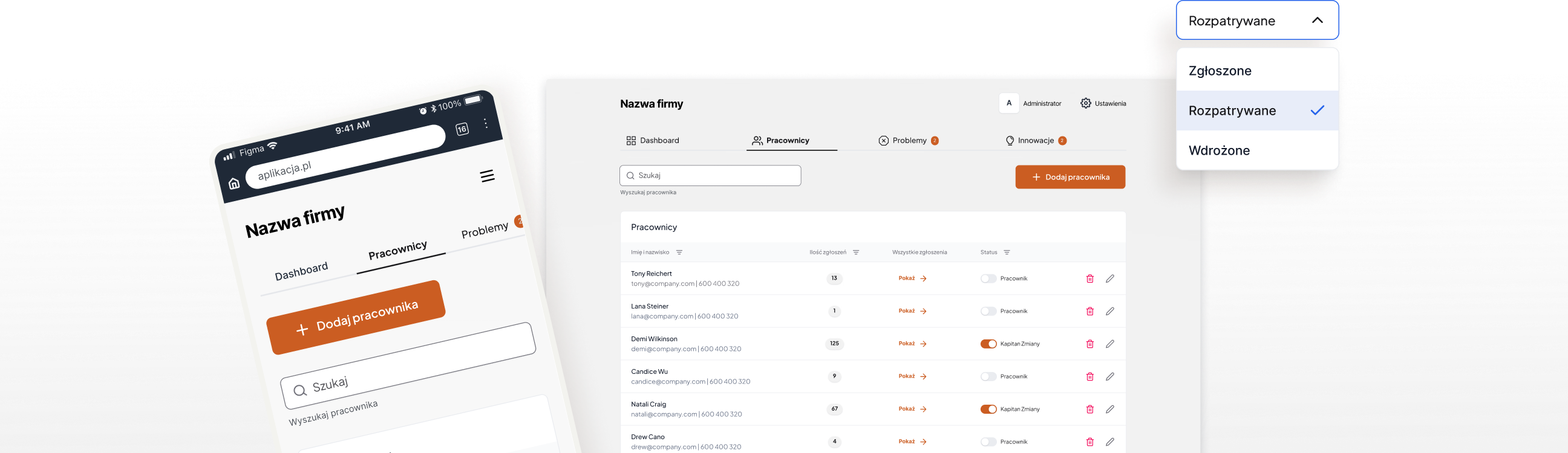
Design is not only about creativity... it is mainly about logical thinking
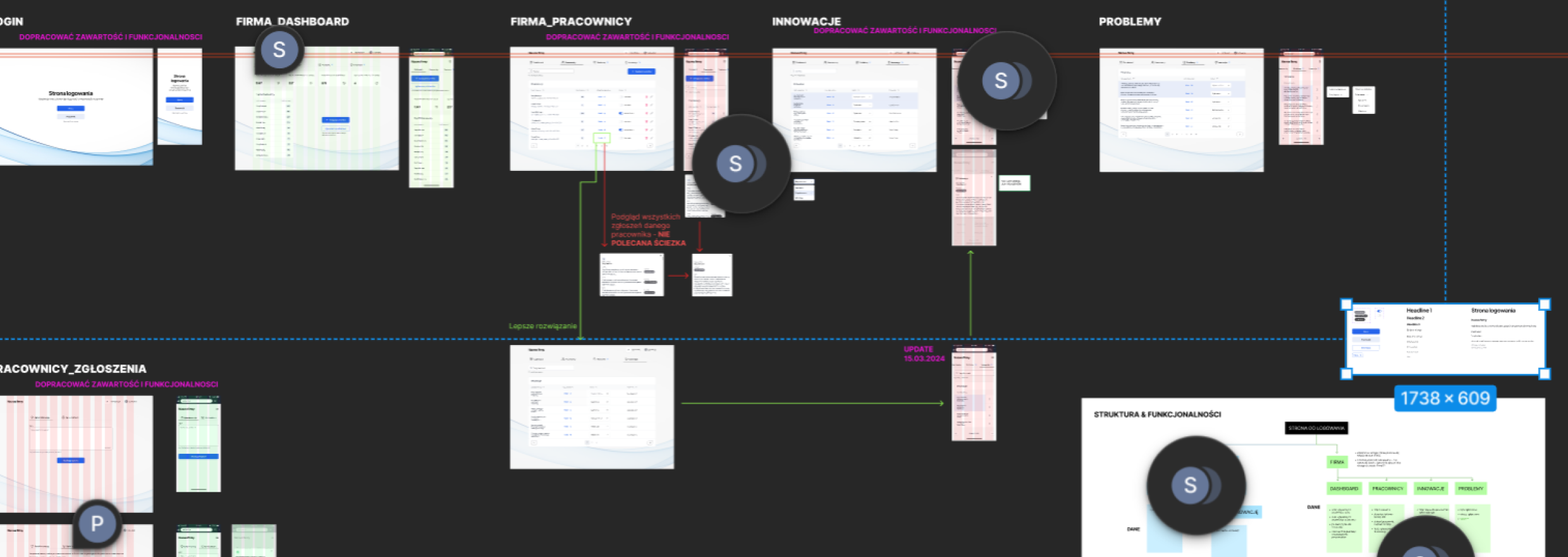
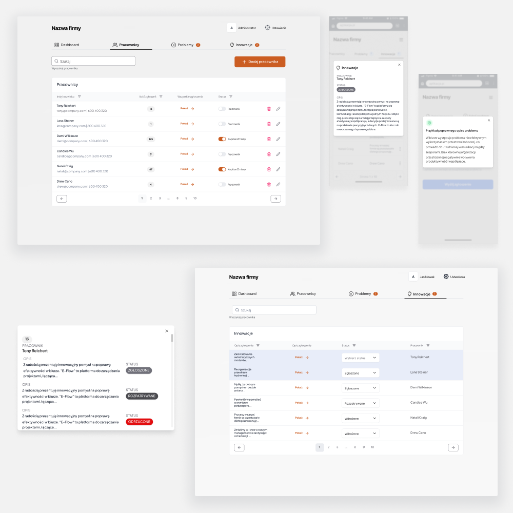
After 30 minutes of the presentation, I did not understand how the application worked, so based on my notes, I wrote out its structure and added functionalities. This was the basis for further considerations on what it should look like so the user could use it easily. The diagram turned out to be very useful, not only for me.
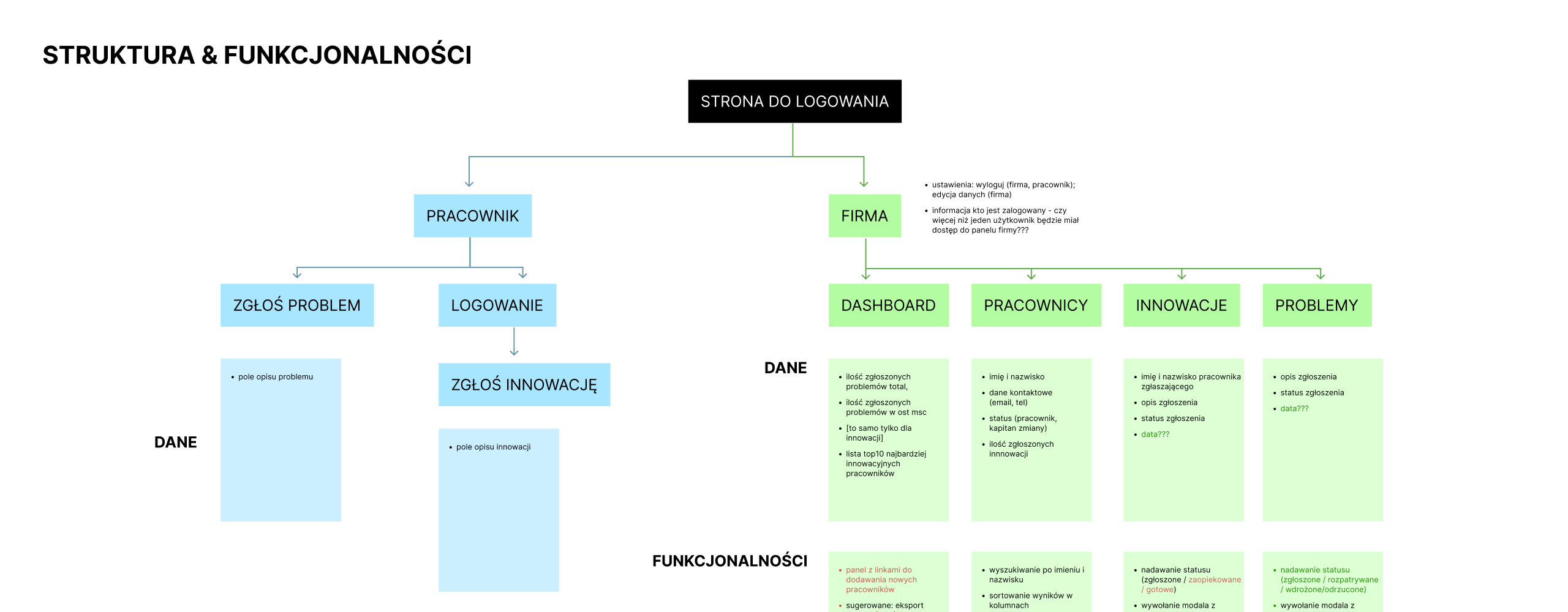
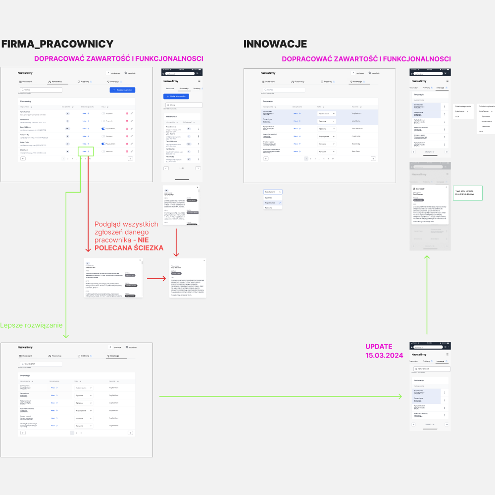
The intricacies of functionality
While designing some screens, we discovered that the functionalities and dependencies had not been fully thought out. We had to find a place for them and combine everything coherently.
Some functionalities were deleted in this process, and some changed their place - it was supposed to be only a UI task :p
Many messages were resolved with modals and pop-ups. Thanks to this, we saved space on the screen without forcing the user to scroll endlessly. We ensured the models were legible, easily accessible, and quickly closed.
Final conclusions
An unexpected ending
20 hours spent on thinking, designing 18 screens (9 desktops, 9 mobile), and short meetings resulted in permanent cooperation.
My role in this project is over - I set some direction, gave suggestions regarding tests, and paid attention to logic and aspects of transparency and compliance with Polish law. I'm eagerly awaiting the final result of this quick task :)